Building brands with purpose and personality.
From logos to complete visual systems, each identity is thoughtfully crafted to tell a story, create connection, and give brands a memorable presence.
OUR Arts Foundation
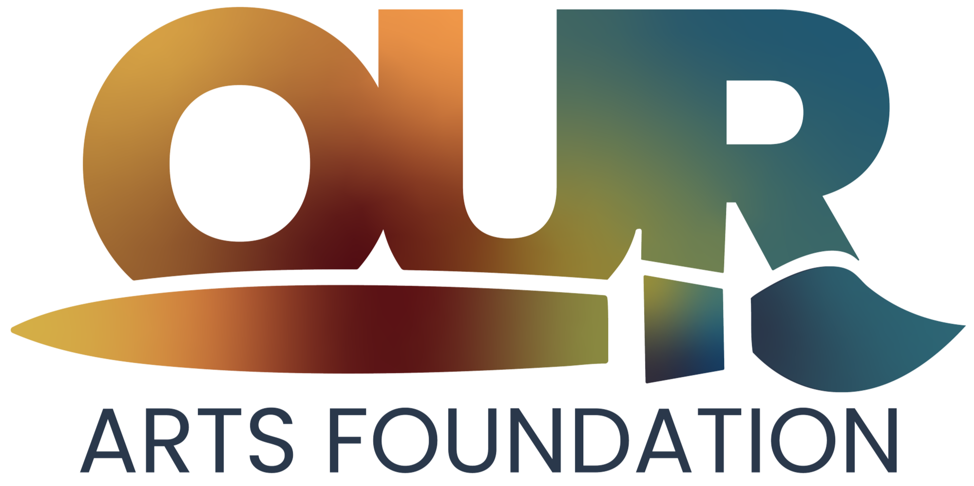
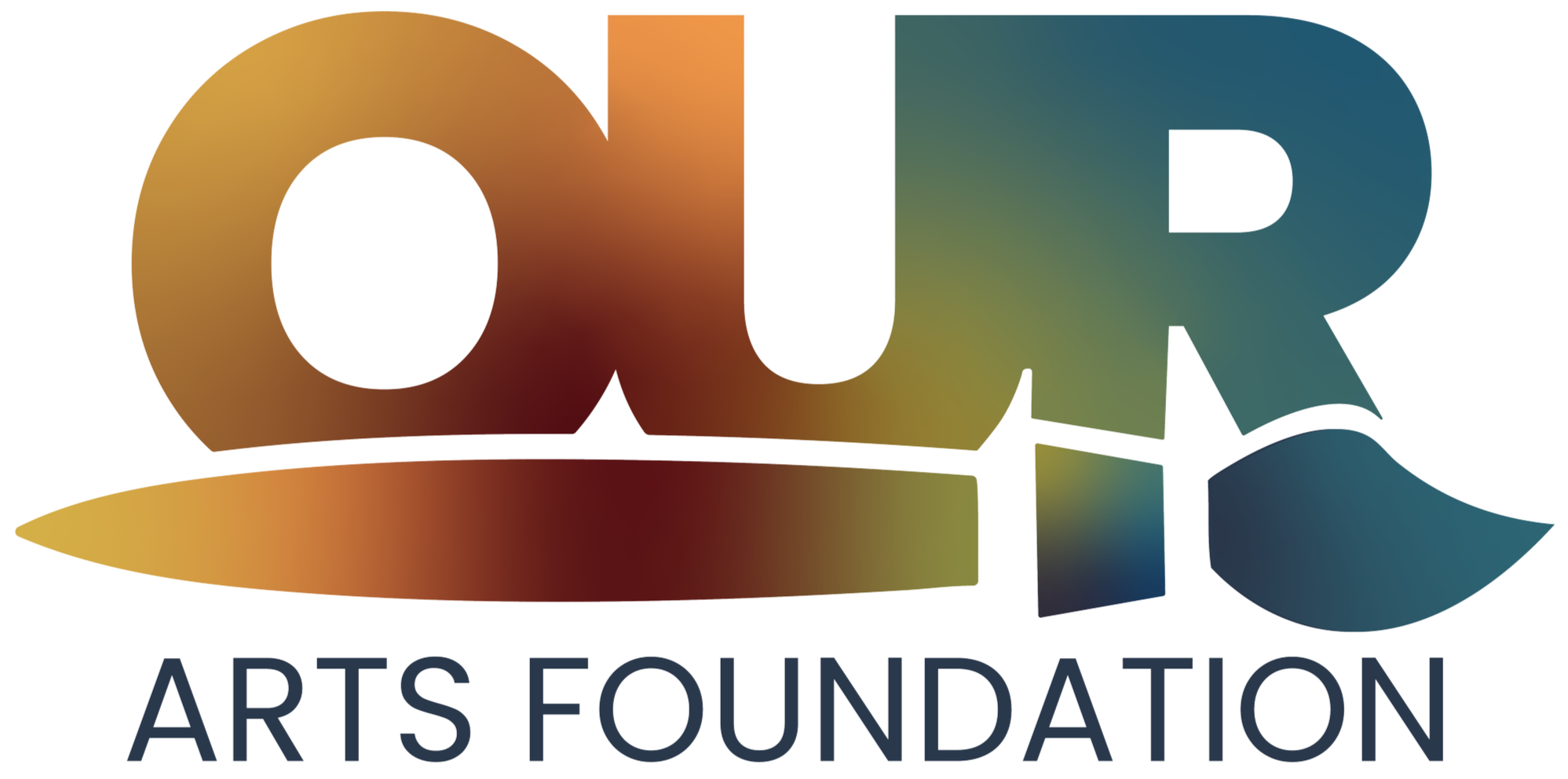
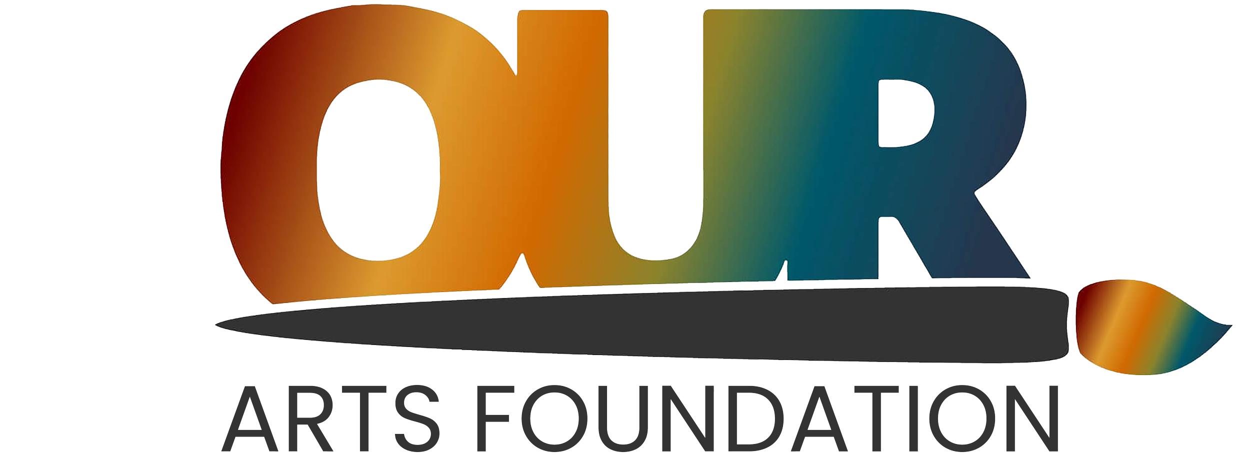
OUR Arts Foundation came to me with an existing logo that needed a thoughtful refresh rather than a complete redesign. I started by addressing the symmetry and overall balance, removing the visual weight created by the paintbrush extending beyond the edge of the mark.
I wanted to preserve the brand’s existing color palette while giving it a softer, more organic feel. I replaced the original linear gradient with a fluid, blended gradient that feels more expressive and connected to the organization’s focus on art.
The typography was also updated to a more structured, square form with sharp edges, giving the identity a sense of strength and stability. Finally, I integrated the paintbrush more seamlessly into the lettering so the elements feel like one cohesive mark rather than separate pieces.
Because OUR Arts Foundation uses art as a form of therapy, I wanted the refreshed identity to visually communicate that same idea of connection—art becoming something integrated into us rather than simply something we create.
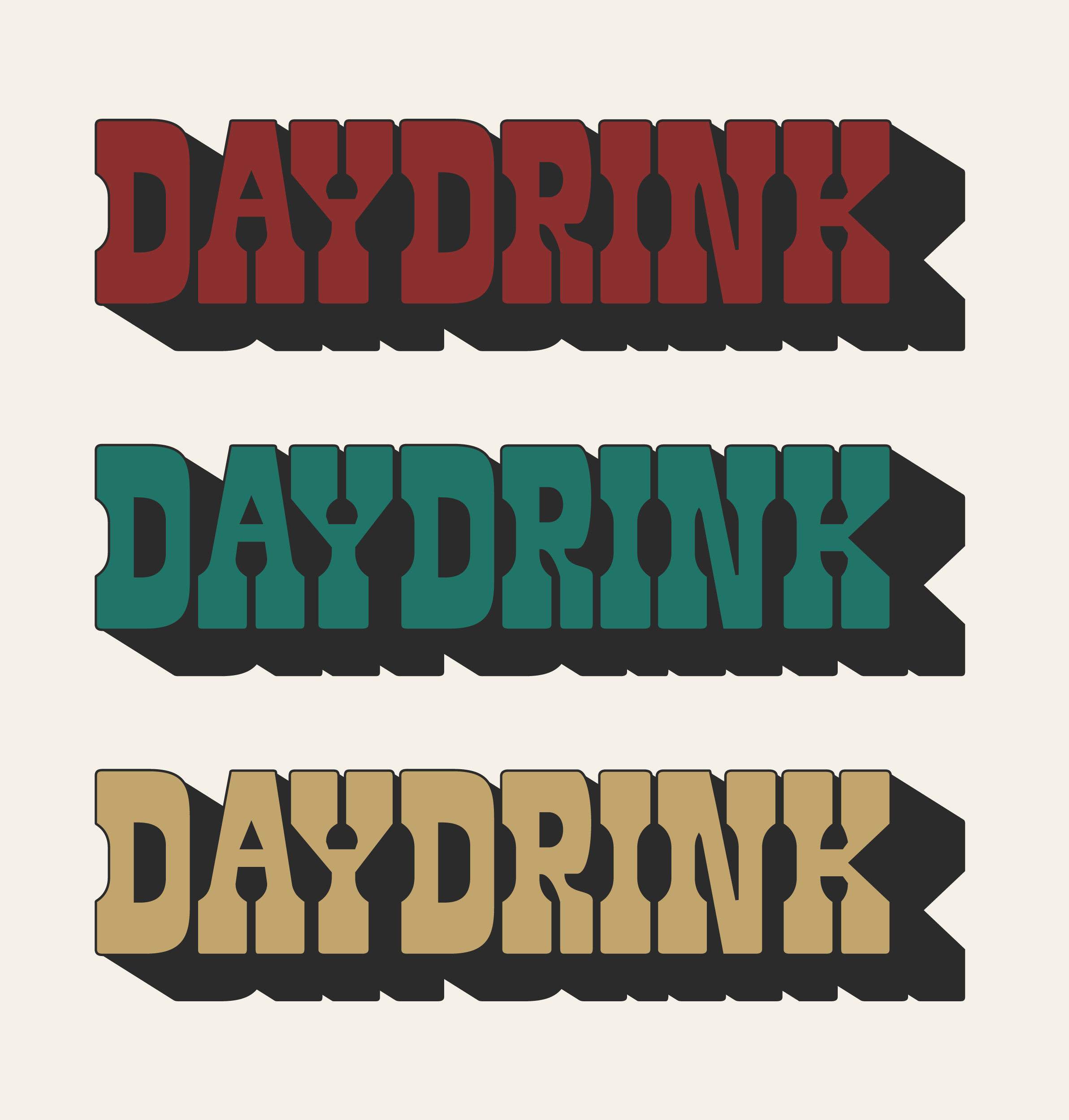
DAYDRINK
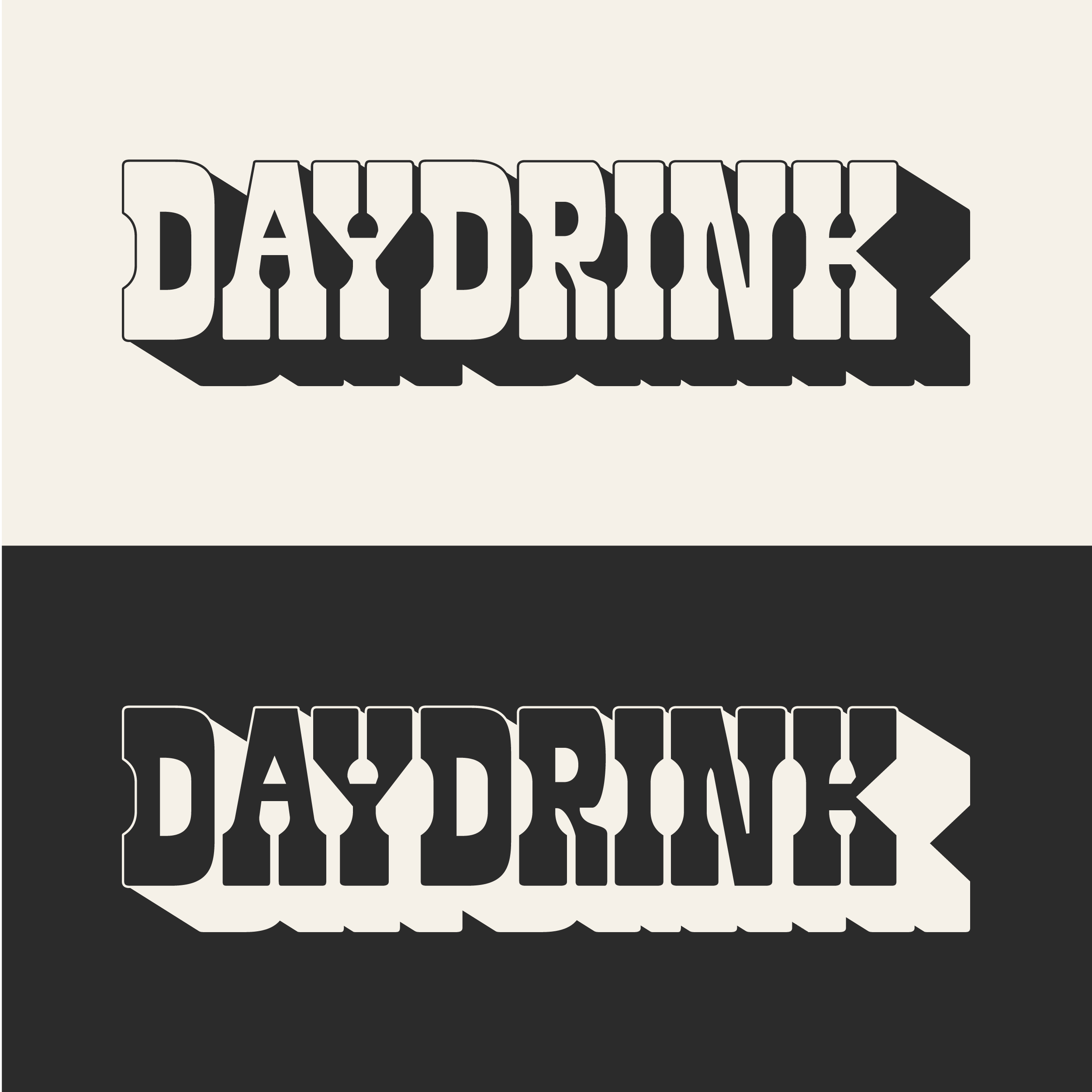
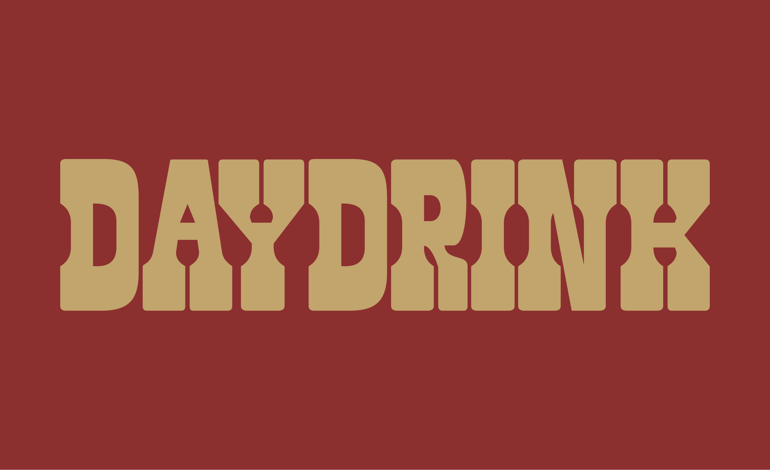
I used typography, supporting graphic elements, and a bold color palette to build an identity that feels established, distinctive, and unapologetic.
Every element was intentionally chosen to reinforce that sense of strength and familiarity while giving Daydrink its own personality within the growing non-alcoholic beverage market.
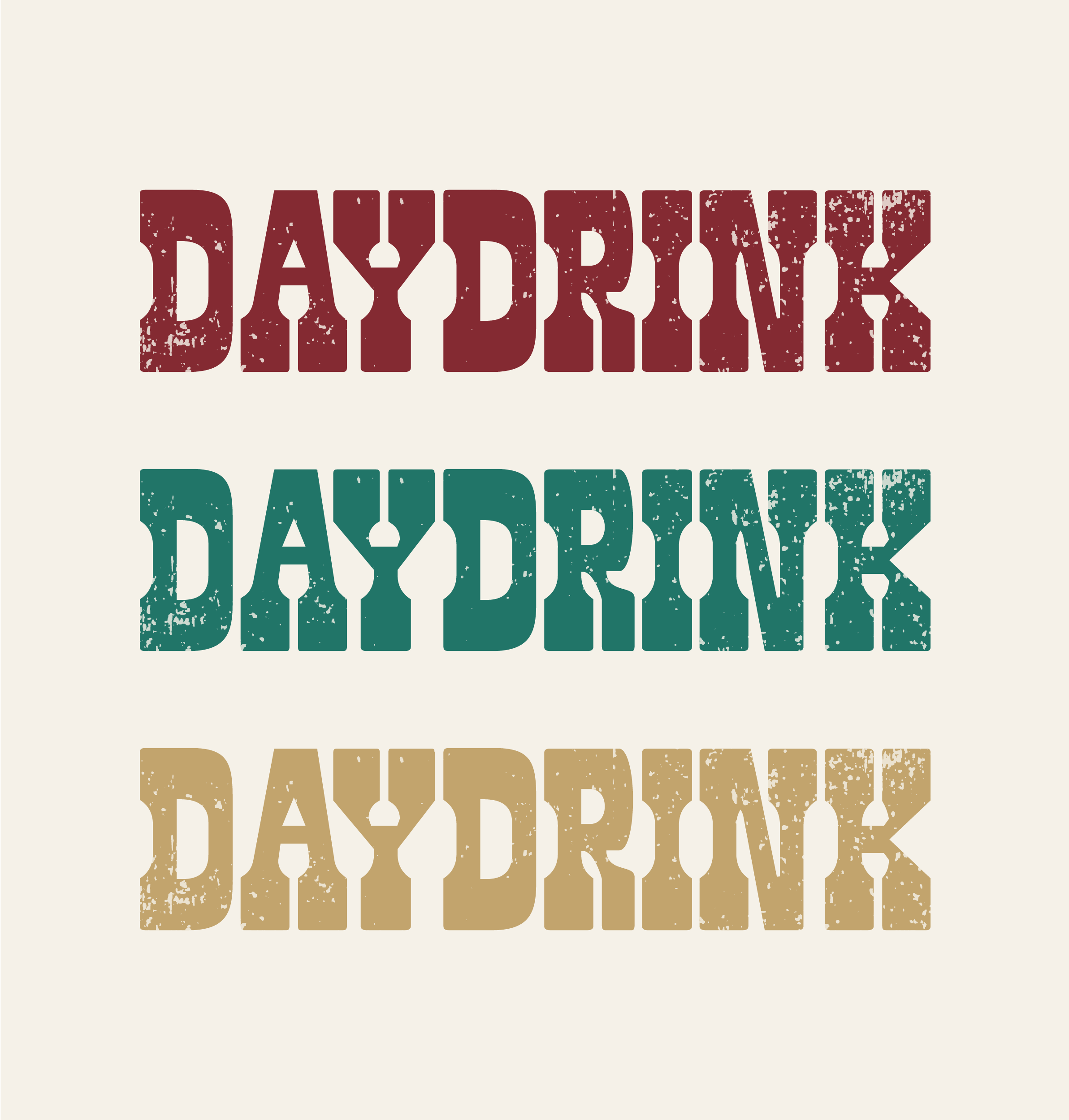
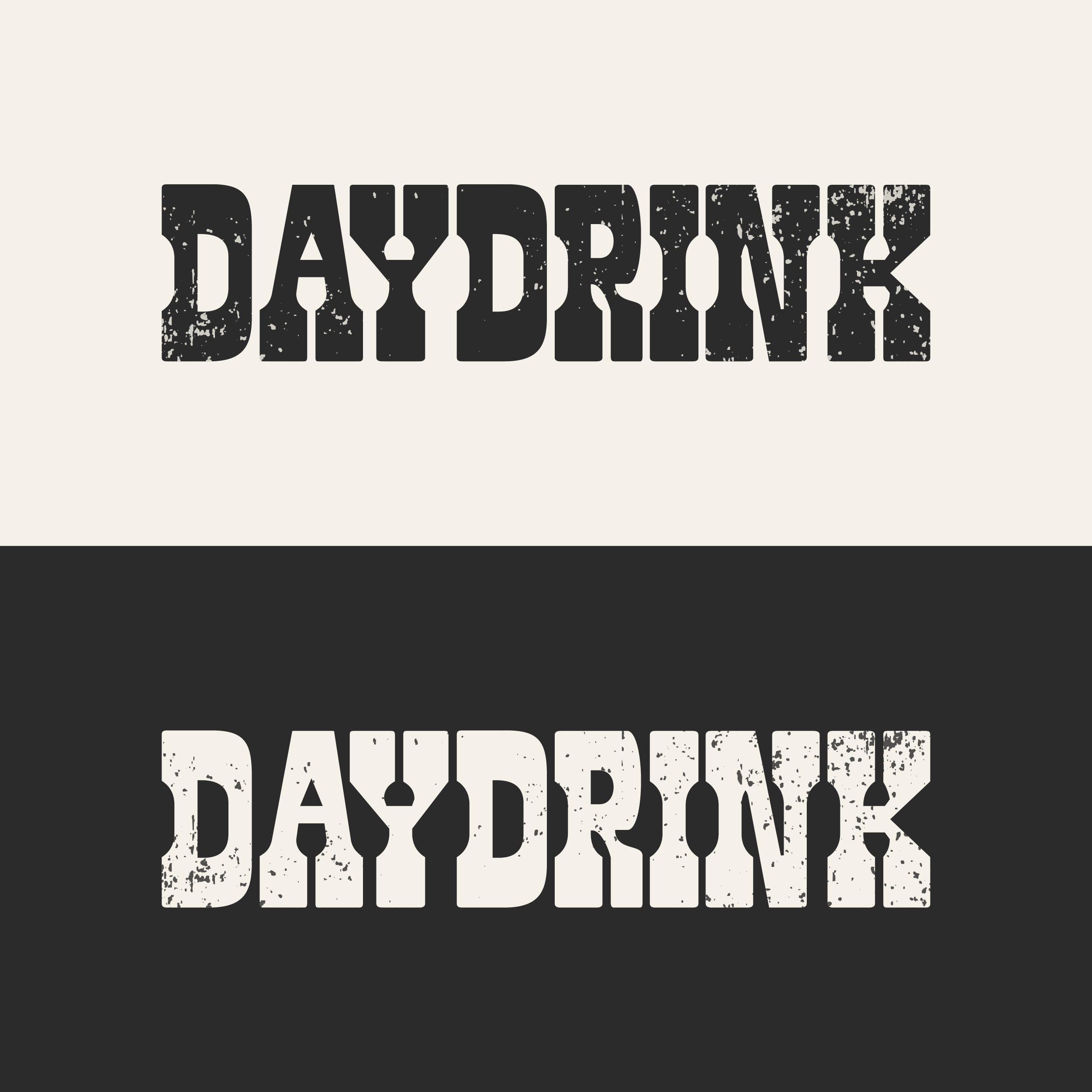
Daydrink came to me as a new brand looking for a visual direction. As a non-alcoholic lifestyle beverage centered around health and wellness, the challenge was creating an identity that felt contemporary while still carrying the familiarity and confidence of an American classic.
The brand wanted to evoke the visual language of old-school beer cans and cigarette cartons, with an American heritage feel that leaned traditionally masculine and confident.
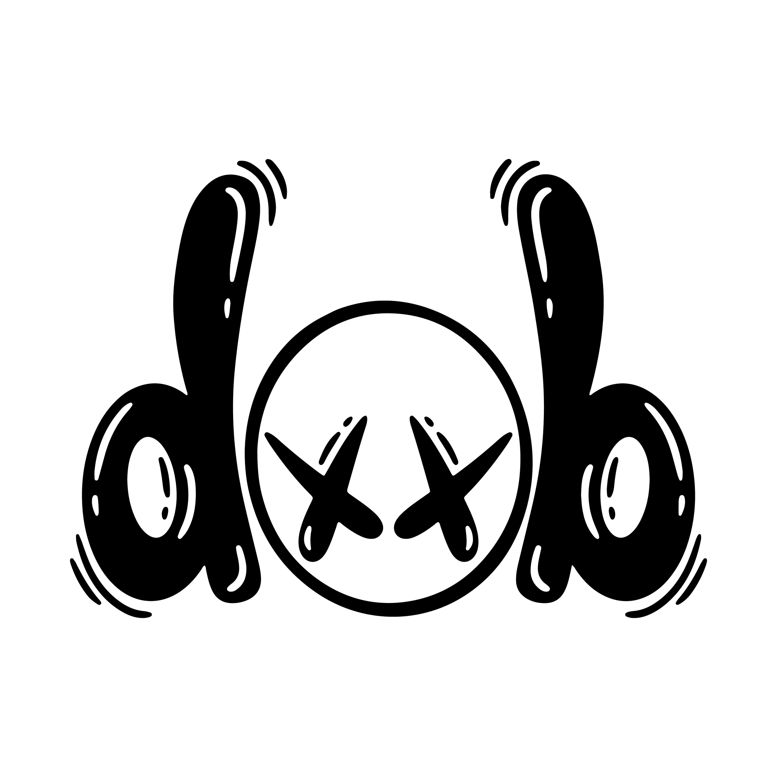
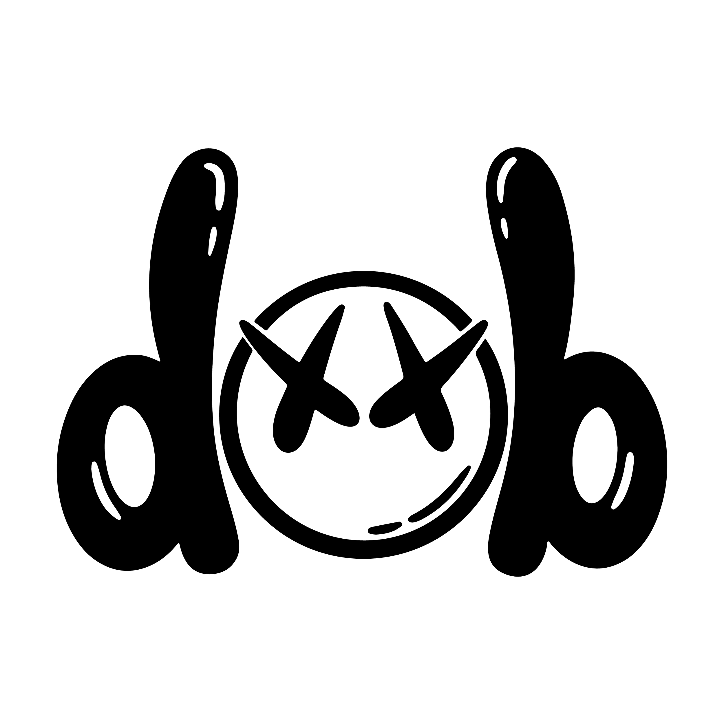
I also wanted the logo to have a sense of discovery, using his name to create a shape that subtly resembles a pair of headphones around a listener.
The result is a mark that feels energetic and artistic while incorporating a visual concept that is personal to both his name and his music.
Dob Music
This musician wanted a graphic identity with an illustrative quality that could capture his name, energy, and personality as an artist.
I looked to graffiti art as a visual reference, drawing from its expressive, energetic qualities and its connection to the style of his music.